ENJOY 10% OFF YOUR FIRST ORDER


Discover our Products


Chestnut Checker Canvas
£200.00
Regular price
£200.00


Cappuccino Silhouette Abstract Canvas
£210.00
Regular price
£210.00


Soft Terrain Landscape Canvas
£145.00
Regular price
£145.00


Coastal Horizon Canvas
£210.00
Regular price
£210.00

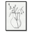


Abstract Botanical Framed Print
£45.00
Minimum price
£45.00
Maximum price
£100.00


Mocha Geo Dot Canvas
£200.00
Regular price
£200.00


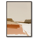
Connected Forms Abstract Capped Framed Canvas
£90.00
Minimum price
£90.00
Maximum price
£140.00


Checker Relief Canvas
£200.00
Regular price
£200.00


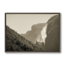
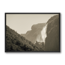
Mist Falls Landscape Framed print
£45.00
Minimum price
£45.00
Maximum price
£115.00
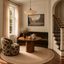


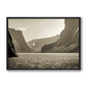
Sepia Falls Landscape Framed print
£45.00
Minimum price
£45.00
Maximum price
£115.00


Vintage Horse Sketch I Framed Print
£60.00
Regular price
£60.00


Vintage Horse Sketch II Framed Print
£60.00
Regular price
£60.00
Neutral Home Decor: Does Your Wall Art Have to Be Neutral Too?
No, your wall art doesn't have to be neutral just because your home is. A neutral interior is a flexible backdrop that works with soft, tonal art and with pieces that bring in colour and contrast. What matters is how you want the room to feel.
Here's how to decide which direction suits your space, and how to get it right either way.
The case for neutral wall art
Tonal art feels effortless in a neutral home. Soft whites, warm greys, oatmeal and sand layered together create a calm, cohesive look that suits a living room or bedroom, where you want to switch off.
Neutral doesn't have to mean dull. In a quiet palette, you notice texture more: the grain of a canvas, the brushwork in an abstract, the weave of a linen cushion. The room gets its character from detail rather than colour.
Neutral wall art also has staying power. It adapts easily to new cushions, a different sofa or a seasonal refresh, so you're less likely to tire of it.
The case for adding colour
A neutral room can feel a little flat without a point of interest. One piece of colourful wall art gives the eye somewhere to land and makes the space feel finished.
You don't need bright, busy colour to do this. Deep, grounded shades like olive green, terracotta, rust, chocolate brown and inky blue add depth while keeping the mood relaxed. Choose art with soft edges and organic shapes so it feels part of the room rather than set apart from it.
A large canvas works especially well here. One generous piece in a confident colour will look calmer and more intentional than several small ones.
How to decide: four simple questions
If you're torn, work through these.
Colours that work well in a neutral home
If you're ready to add colour, these pairings are easy to live with.
Warm whites and creams pair well with terracotta and rust. Greige and stone suit olive and deep greens. Oatmeal and sand look rich with chocolate brown and clay, while cool greys work beautifully with navy and slate blue.
Styling tips for either approach
So, do neutral homes need neutral art?
They can, and the result is often beautiful, but they don't have to. A neutral home gives you the freedom to choose either calm, tonal art or a considered splash of colour. The best choice is the one that makes the room feel good to live in, not just good to look at.
Ready to find the right piece for your space? Browse the wall art collections at Interiors by Koti.